YouTube has thousands of videos uploaded everyday; these videos vary from music videos to stuff made by everyday people. For the assignment we were to look at one of these YouTube videos and analyzed its production value and how it worked. The video I choose was a short film, only a little over two minutes. The video was a parody of Star Wars, using some of the movie’s famous images and props. In summary, the video started like all Star Wars films start; having the 20th Century Fox and Lucas films logo display like the actual movie was starting; except the people put their fake company in instead of the logos. After that the famous strolling of the Star Wars’ episode title comes down and gives a background of the story, except this time a voice reads what the plot of this video is-that during the production of the original Star Wars trilogy a man by the name of Marvin Kaufman made a real working lightsaber and had to hide it and himself after he accidently killed an extra. After the voice finished what was being read, the video goes to a wide shot of a twenty-year old guy-Eric Beck-building a lightsaber of his very own so he can rob a bank. It then cuts to a scene where he heads to an elevator and Marvin pops out and challenges him to a fight. In the end they find out that the lightsabers don’t work like they do in the movie but the Eric accidently kills Marvin since the lightsabers do cut through people. This video’s production was basic, but it had a few wide shots, medium shots, and few cut scenes/cut-away. The one thing that was interesting was that the camera was stationary throughout the whole video but it worked because the characters really didn’t do that much moving. Another thing is that the types of shots they did really showed the emotions and actions of the two characters. For example, when Marvin came out of the elevator, they did a close up shot of him and then an even closer shot of just his eye to show his anger. This video was very funny and made of use of some general filming techniques, but it was enough to make it effective. Below is the link the YouTube video.
http://www.youtube.com/watch?v=dsZNiCSCLXw
Monday, March 22, 2010

Friday, March 19, 2010
Graphic Design Project

For my next project in Visual Literacy, I was to use Photo shop to make a graphic design piece that would have a particular message. The message I wanted to state deals with the issue of Education in the United States of American. The USA is right now dealing with a major economic recession, and in order to save money, states everywhere are cutting their education departments in order to help balance their state budgets. With states cutting back on their funds for their schools, and with the "No Child Left Behind" Act still not being funded properly, schools everywhere are suffering. As a major supporter of improving the education system in this country I wanted to make a small poster-something you would see on a bench in the park, or a sign you would see as you ride the metro rail, that would help spread the word of the message of funding our schools.
What I did is I took a picture of children popping their heads out of a school bus, and edited it a bit. I first got rid of the words on the bus, and painted it with a different shade of yellow. After the bus was painted yellow I then added the text. On the top part of the bus I put the phrase "Fund Our Education" in bold letters. On the lower half of the bus I wrote "Let us go to school! We're the future!". The placement of this text on the bus makes it seem that the kids themselves are stating this message as if they don't want to stop going to school. In the white space under I place the phrase "Where will they go in life without School?". The placement was perfect making people who see this poster see the question and making them think what would they do without school. After that I decided to paint a background of the American Flag, as if it was behind the picture of the school bus. Since I draw like a 1st grader, it actually gives the sense that a child made this poster and is telling adults that he/she wants to still go to school. The other things I did to the poster was I made a glowing effect on the side, to make it seem that the bus would lead to a bright future if they had the funds. I then sharpen the edges to make the picture stand out more and made some small blurs to make it seem more animated. With these effects in I can see that if this was placed in public it would send the message that these students want to go to school, but need you to demand the state and federal government to fund them, for they will be the future of this country. That is what I try to state in this project and I hope my message was strong enough to be seen.
Wednesday, March 3, 2010
Self-Portraits


For this blog, I was supposing to show three self-portraits of myself and how I edited them on Photoshop. The portraits are all unique for they were all edited differently. For the first portrait, it was a picture of me in a classroom. What had to be done first was to remove the people in the background, which was painted blue by a paintbrush. Once it was removed the background, a glass distortion was made as well as a grain effect. These two effects combined made the photo distorted but effective.
For my next photo I had kept my background in place and changed it to a cloud effect and painted the lower half of the picture green to make an outdoors effect. The face itself was first turned into a mosaic and then made watercolor to a low degree. The whole picture is watercolor, which gives it a burly and painting effect. The watercolor look made it a nice more comfortable and childish look. Then the sponge finished it up so that it kept that watercolor look.
A shadow was cast over the picture giving my face a half black and half clear look, as if the sun was dividing the face. The third picture and possibly the most interesting were made into a more, satanic look. The first effects where to give it a craquelure look by making somewhat shallow cracks yet very visible as they were pretty close to one another. After that the background took on a canvas look and turned the light of the background coming from the top right hand corner. Then the satanic look came into more effect when the face was burnt red, the shirt was darken, the eyes where given a deep red dot, and part of the background was partly painted black. So that is how these three pictures came into their new forms.
Monday, February 15, 2010
Photo Assignment: Happiness
For our photo project, we were given the topic of happiness. The task was to make a convincing argument about our photos and how they represent happiness, and I believe that we (the group) did a good job of doing that. The first step was to think of what would be the ideal use of happiness; thanks to the blizzard that came into town, we were thinking that a winter wonderland would be a true form of happiness that anyone can agree with. We were to take photos of simple things that kids (and college students) would do in the snow; whether that would be building snowman, making snow angles, or having a snowball fight. On the day we began to work on the photos we decided that to go with the snowman idea and build one ourselves. With some effort and luck, we were able to make a lifelike snowman sitting down on a bench in the Quad, just enjoying the sunny day that we had between the two snowstorms. The idea that a snowman was to capture happiness was partly due in the lighting. The white snowman with a white background, and some simple red eyes, smile, buttons, and flower, and the brown bench made the snowman’s features stand out much more, showing the happiness it had. The next thing we did was we took pictures of people with the snowman, as if he was a real person and having a good time. We showed a picture of a girl smiling and giggling with the snowman, a guy and the snowman smiling and just chatting it up, and plenty of other pictures showing happiness. The angle that we shot the photos captures the warm smiles of both the snowman and the person with the snowman, thus giving the idea that everything is happy. My favorite shot of the photo was with the snowman and a girl who volunteered to be in the photo, laughing “with the snowman”. The photo had the focus on the girl and snowman at hold, capturing the face and body of the girl as she laughs with hysteria, placing her hand on the snowman’s knee, showing a warm feeling between the two. The snowman was in the far left of the frame, in the sense of the rule of thirds and therefore making the girl the focus and with her body facing and leaning toward the snowman, made it focus on the happiness in her face. In all, this project was a success, but had things that could have gone better. I liked the group, we did work well, but we didn’t have the best schedules. Finding time to actually meet was hard, and we had to divide up the work into two smaller groups, not to mention that I wasn’t able to make final editing due to work. I don’t want to sound like the odd man out but I really didn’t feel welcome in the group, I felt left out, as if they really bonded well together and I was not really “part” of the group. Maybe it was the fact they were all from California and I was from New Jersey, I don’t know, but I wasn’t welcome, even though I liked the group. The most important thing I learned from this assignment was how to use the tools photography to make an effective message. I can use angles, focus, and so on to make a photo mean something different.
Monday, February 1, 2010
Benetton’s Unusual Propaganda
For this week’s blog, we were to read a chapter from a book about Propaganda and if the imaging was used in a positive way or not. After reading about Benetton’s clothing chain’s advertisement strategy I was confused on what they were thinking. The idea that shocking and somewhat hard-to- look-at images will draw in more costumers to their products didn’t make as much sense to me as it did to them when they were drawing out the plans for this advertising campaign. The idea of using images such as two horses mating, and a man with AIDS on his deathbed would draw in the target group for their product (young adults between the ages of 18-24) seem to be a very odd way to get their attention. Though it is an image that wouldn’t leave the mind anytime soon, and thus remind the young adults of the brand name, the images really didn’t flow with the product. As a clothing company, I would use images such as a young couple holding hands with the photo focused on their jeans or their torso if I were to sell the product, but to me, these images where just a way to get some shock factor. The idea that ads like this will be seen by other people, not just the target group has to be taken, and when children to elderly people see this image, it could easily upset or offend them in some form. Companies have to realize that images are powerful and that they can be taken anyway, and should be aware of the conscientious of their actions. Even if companies think “Any publicity is good publicity” they have to take in the fact that the people and market will determine if the images are good enough to help sales; because of Benetton’s images, they lost shelf space and lost millions of dollars for their campaign. Everything has to be taken in perspective, and when using images you have to know who you are targeting, but you should also relate it to your product and not do some random image for mare shock value. This is propaganda for sure for it is nothing more but a somewhat shock and aw campaign where the people are to be stun in some way by what they see. These campaigns in the marketing world are dangerous for they can go either way and can hurt the company just like it did here for Benetton.
Sunday, January 24, 2010
Second Blog
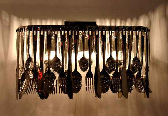
I was able to find three photos similar to the ones on pages 210-211 in the Photo Idea Index book. All the pictures I found where of silverware just like the one in the book, and even though they are all silverware, how the photos were taken made them very unique. The first photo deals with a wide shot of forks, knifes and spoons dangling from a some kind of utensils rack. What makes this photo effective is that the wide shot makes the entire rack of silverware in focus, making you see all of them. The dim lighting in the background and the beam of light cutting right through the middle of the photo make the silverware sparkle showing how perfect they are. The next photo of silverware is of a fork, knife and spoon in a crisscross format, with droplets of water on them on top of brownish forks, knifes and spoons. This photo works for the dark background really shows the top three silverware. It makes the views eyes look straight at either the fork or the knife and head downward toward the connection point of all three utensils. The lighting here also makes you focus on the water droplets on them making you think how clean they are. The last photo I choose is of a fork, knife, and spoon rapped in a napkin on a dark surface. In this photo, the effectiveness is the angle at which they place the utensils, making them point turned the top left of the photo, making the eyes of the views go upward toward the left and seeing the whole set up of the silverware. How the lighting works here as well is the fact that the dark surface contracts the light colors of the napkin and the silverware. All of these photos are connected to the links below in the order they were discussed.
http://farm1.static.flickr.com/201/512417652_8bb7a022e7_o.jpg
http://www.imaginagrapher.com/images/Products/silverware_color.jpg
http://www.napkinfoldingguide.com/19-diamondpouch/napkinfoldingpictures/diamondpouchfold.jpg
http://farm1.static.flickr.com/201/512417652_8bb7a022e7_o.jpg
http://www.imaginagrapher.com/images/Products/silverware_color.jpg

http://www.napkinfoldingguide.com/19-diamondpouch/napkinfoldingpictures/diamondpouchfold.jpg

Monday, January 18, 2010
Visual Literacy Assignment # 1
For my first blog and my first assignment for Visual Literacy, I am to talk about a photograph from a newspaper or website and describe the image’s effectiveness in conveying its message by using three examples from the book Photo Idea Index. The image I took was an image from a Los Angeles Times article online that was dated on August 19, 2009. The image is of U.S. Soldiers inside a C-17 bowing their heads in respect of the caskets inside the plane; each casket is a fallen brother or sister in the war in Afghanistan. Each casket has a U.S. flag, honoring those who had fought for their country and died in its name and what it stands for. The image is truly powerful for it shows the cost of war, but how the shapes, colors, and lines/curves of the image due help show the true price of war. The shapes of this image are powerful, epically the flags on the caskets. The flags are rectangular, but how the flags hug the caskets make them less like American Flags and more like blankets for the soldiers as they now rest in peace. This shaping makes it so that these soldiers where the cost to keep our liberties safe. The shapes otherwise where nothing more but the length of the plane showing how many bodies there are, and it’s circular opening of the plane shows a somewhat comforting feeling stating they are finally at peace The line and curves of the photo are just as important to show the impact. The soldiers honoring the fallen are in a straight perfect line with one another. The caskets are in prefect straight paths showing that the Army shows as much respect as possible for those who have fallen and for those who have served. The coloring of the photo is also important. The caskets have direct lighting making them the center of attention in the photo, making the viewing think of what the cost of the war really is, and if it is still worth fighting for. The bright lights make the American flag on the caskets really show out and show the pride of the Army and the fact that these soldiers fought for was in the name of the country. These concepts do indeed make the photo much more powerful and therefore much more effective in understanding the message of the cost of war. I am also sorry, I haven’t had luck getting the photo up so I am adding the link of the direct photo. Thank you.
http://latimesblogs.latimes.com/.a/6a00d8341c630a53ef0120a55d449e970c-300wi
http://latimesblogs.latimes.com/.a/6a00d8341c630a53ef0120a55d449e970c-300wi
Subscribe to:
Posts (Atom)